
Project Type
Bulding Design System
Methods
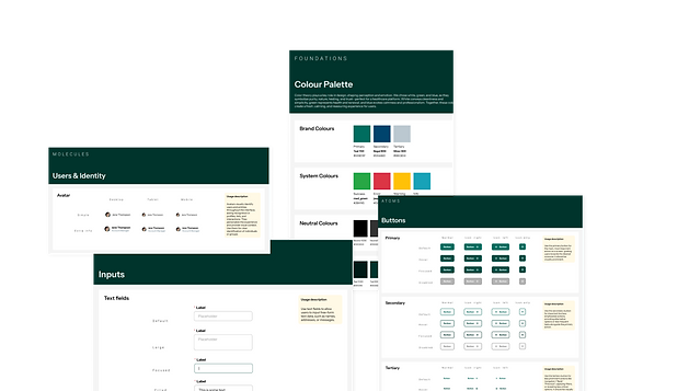
Atomic Design System
Rapid Prototyping
Tools
Figma
Duration
4 weeks
PROJECT OVERVIEW
Background
This project was inspired by a real-world platform I worked on, where the user interface lacked cohesion and consistency. Each part of the product used slightly different components and patterns, which not only created a fragmented user experience but also slowed down the design process significantly. Designing even simple screens required constant recreation or rethinking of components, leading to inefficiencies and inconsistencies across the platform.
To solve this, I decided to initiate and build a scalable design system that could unify the platform's visual language, speed up prototyping, and improve collaboration between designers and developers.
Role
This was a personal project, but I took on multiple roles to simulate a real product team environment:
-
Design System Architect – Defined the structure, component taxonomy, and naming conventions
-
UX/UI Designer – Built atomic and component-level designs based on usability and flexibility
-
Prototyper – Used the system to rapidly prototype key interface patterns
-
Documenter – Created supporting documentation and component guidelines for clarity and consistency
Objectives
-
Unify UI across the platform by creating reusable and consistent components
-
Speed up the design process through a modular system that allows for rapid prototyping
-
Promote design consistency by standardizing layouts, typography, color usage, and interactions
-
Lay the foundation for better collaboration between design and development through clearer handoff and shared language


OUTCOME
Outcome
The design system had a significant impact on both the speed and quality of the design process:
-
Designing new pages now takes just ~2 minutes, compared to the previous 4–5 minutes of manually assembling and styling components from scratch.
-
Scaling designs across breakpoints (mobile, tablet, desktop) became almost instant, thanks to responsive components and auto layout setup.
-
The system drastically reduced design inconsistency, with shared components automatically updating across files and screens.
-
It laid the groundwork for faster developer handoff, with clear naming conventions and a shared, centralized component library.
-
The system is now easily scalable and could support future product features or branding changes without having to start from scratch.